Chapter 6
An Introduction to Color Vision
WILLIAM E. BENSON
Main Menu   Table Of Contents

Search

ELECTROMAGNETIC ENERGY
RETINAL ORGANIZATION
COLOR PERCEPTION
FACTORS THAT MODIFY COLOR PERCEPTION
COLOR MIXING
COLORLESS OBJECTS THAT APPEAR COLORED
COLOR VISION DEFECTS
COLOR VISION TESTING
DEMONSTRATION REQUIREMENTS
DEMONSTRATIONS
SUGGESTED READING

ELECTROMAGNETIC ENERGY
The basic building block of matter, the atom, consists of a nucleus (composed of protons and neutrons) and electrons, which revolve around the nucleus (Fig. 1). The electrons do not revolve at random distances from the nucleus but in orbits of approximately fixed diameters. An electron can move from its orbit to a higher one if it receives energy from an external source (e.g., a flying electron, heat). However, the electron remains in the higher orbit for only one hundred-millionth of a second. As it falls back to a lower orbit, it releases its excess energy by emitting a small packet of energy called a quantum or a photon (Fig. 2). The farther the electron falls to reach its original lower orbit, the greater the energy of the photon.

Fig. 1. A hypothetical atom. Electrons in somewhat fixed orbits revolve around the nucleus.

Fig. 2. When electrons fall to a lower orbit, photons are released.

In a vacuum, all photons move at the speed of light. As they travel, they vibrate, causing measurable electric and magnetic effects alongside their line of travel. Photons can be characterized by their energy; by their frequency of vibration (in v/second); and by their wavelength (λ), the straight-line distance a photon moves during one complete vibration. The higher the energy in a photon, the faster it vibrates. Frequency and wavelength are related by the formula f × λ = c, where f is frequency of vibration, λ is wavelength, and c is speed of light (approximately 3 × 10⁸ m/second). Rewriting this as f = c/λ, we see that f and λ are inversely proportional (i.e., as frequency increases, wavelength decreases). For example, gamma rays have a very high frequency and a very short wavelength; radio waves have a very low frequency and a long wavelength.

Photons are usually classified according to their wavelength. The full range of photon energy is called the electromagnetic spectrum (Fig. 3). Light, x-rays, gamma rays, and radio waves are all forms of electromagnetic energy. The reason we can “see” light but not other forms of electromagnetic energy is that the rods and cones of the retina contain pigments that preferentially absorb photons with wavelengths between 400 and 700 nm (a nanometer is a billionth of a meter) and convert their energy into an electrical reaction (neuronal impulse) that is carried to the brain. Wavelengths longer than 700 nm and shorter than 400 nm tend to pass through the sensory retina without being absorbed (Fig. 4). Actually, the retina is capable of seeing photons of shorter wavelengths (ultraviolet light), but the cornea and lens filter them out. A person who is aphakic may be able to see ultraviolet light.

Fig. 3. The electromagnetic spectrum.

Fig. 4. Photoreceptor pigments absorb photons with wavelengths between 400 and 700 nm.

Light quanta can be characterized not only by wavelength but also by the sensation they cause when they strike the retina. Quanta of shorter wavelengths are perceived as magenta, blue, and green; those of a longer wavelength are perceived as yellow, orange, and red (Fig. 5).

Fig. 5. The light spectrum.

Electromagnetic quanta travel at the speed of light only in a vacuum. If they enter any other medium, such as glass, their wavelength and speed decrease (Fig. 6). The frequency of vibration remains the same. The shorter the wavelength, the more the speed is decreased. For example, imagine two photons, one of wavelength 700 nm and the other of wavelength 400 nm, traveling through a vacuum. As long as they remain in a vacuum they keep pace with one another. If they now strike a piece of glass perpendicularly, the photon of 400 nm is slowed down more than the photon of 700 nm and falls behind. When they emerge from the glass they resume the speed of light and their original wavelength, but the 400-nm photon remains an instant behind. If they enter the medium obliquely, their paths are bent. The shorter the wavelength, the greater its path is bent. These phenomena explain why a prism breaks up white light into the colors of the spectrum (Fig. 7).

Fig. 6. Photons traveling in a medium other than a vacuum are slowed in inverse proportion to their wavelength.

Fig. 7. A prism separates white light into the colors of the light spectrum.

Back to Top
RETINAL ORGANIZATION
In nature, vitamin A is in its all-trans, alcohol variant (Fig. 8). Unbleached rhodopsin, the visual pigment of rods, is made up of retinal, the 11-cis-aldehyde variant, and a protein called an opsin (Figs. 9 and 10). When light strikes a molecule of rhodopsin, 11-cis retinal is converted back to the all-trans form and is released from the opsin (Fig. 11), initiating an electrical impulse in the photoreceptor that travels toward the brain. The eye then resynthesizes the rhodopsin. Rods function primarily when the eye is dark adapted (i.e., for night vision) and cannot distinguish one color from another. Cones, on the other hand, function when the retina is light adapted (i.e., for day vision). Our ability to distinguish different colors depends on the fact that there are three different kinds of cone, each of which has a different visual pigment. All cone pigments contain 11-cis retinal. They differ in that each has a different opsin. The function of the different opsins is to rearrange the electrons of retinal, thereby changing its ability to capture photons of different wavelength.

Fig. 8. Vitamin A.

Fig. 9. 11-cis retinal.

Fig. 10. Schematic diagram of rhodopsin.

Fig. 11. Schematic diagram of rhodopsin after being struck by a photon.

Red-catching cones (R cones) contain a pigment referred to by Rushton as erythrolabe, which preferentially absorbs quanta of longer wavelengths. It is best stimulated by light of a wavelength of 570 nm, but it also absorbs adjoining wavelengths (Fig. 12). Green-catching cones (G cones) contain chlorolabe, which is best stimulated by intermediate wavelengths. Its maximal sensitivity is to a wavelength of 540 nm. Blue-catching cones (B cones) contain cyanolabe, which absorbs the short wavelengths best. Its maximal sensitivity is at 440 nm.

Fig. 12. Absorption spectra for retinal cones.

The retina is organized so that it sends to the brain an encoded description of the light that strikes it. The initial step is the absorption of photons by the pigments of the photoreceptors (rods and cones) (Fig. 13). The electrical signals are transmitted at connections called synapses to bipolar cells and, subsequently, to ganglion cells. Horizontal cells receive information from many rods and cones and modify these messages before they are sent toward ganglion cells (Fig. 14). For example, if a cone is strongly stimulated, it sends inhibitory messages by way of a horizontal cell to neighboring cones. Bipolar cells send inhibitory messages by way of amacrine cells. The axons of ganglion cells form the optic nerve, which carries information to the brain. The “hue center” in the brain adds up the information from the different color channels and determines which color we see. In general, the hue we see depends on the relative number of photons of different wavelength that strike the cones.

Fig. 13. Basic retinal organization.

Fig. 14. Lateral retinal organization.

Back to Top
COLOR PERCEPTION
To accurately describe any color, one must specify three attributes: hue, saturation, and brightness. Hue is the attribute of color perception denoted by blue, red, purple, and so forth. Hue depends largely on what the eye and brain perceive to be the predominant wavelength present in the incoming light. In simplest terms, this means that if light of several wavelengths strikes the eye and if more light of 540 nm is present than is light of other wavelengths, we will see green (Fig. 15). However, what the brain perceives depends on many other factors, which need further elaboration.

Fig. 15. Hue is the dominant wavelength perceived.

The color wheel is made up of all hues arranged in a continuous circle such that each hue lies between those hues it most closely resembles. Complementary hues lie opposite each other (Fig. 16). Using the color wheel, we can predict the color that will result when two different lights are mixed. There are two basic rules. First, when equal quantities of complements or equal quantities of all wavelengths are mixed, the result is white. Second, when noncomplements are mixed, the resultant color lies between the two original colors (Demonstration 1).* The exact color seen depends on the quantity of each color used. For example, equal quantities of red and green result in yellow, whereas a large quantity of red and a relatively small quantity of green result in orange. Unlike the ear, which can distinguish several musical instruments playing at once, our eye and brain cannot determine which wavelengths of light are present in the color we see. For example, if we present the eye with a light composed purely of wavelength 589 nm, the eye sees it as yellow. However, if light of wavelength 546 nm (green) and light of wavelength 689 nm (red) are mixed in the proper proportions, the eye sees what looks to be the same yellow. It does not perceive that this yellow is composed of red and green light and that no light of 589 nm is present. Similarly, when two complements are mixed, we see white and cannot distinguish this white from the white seen when equal quantities of all wavelengths are present. Further, if we add a small amount of all wavelengths from 400 to 700 nm either to a pure yellow composed only of wavelength 589 nm or to the mixture of red and green, the eye still sees yellow. It cannot determine that additional wavelengths are present in the incoming light.

Fig. 16. The color wheel.


*Refers to a demonstration of color principles. See “Demonstrations” at the end of this chapter.

When we see light composed only of wavelength 490 nm, we call it blue green, as if blue and green light are both present, even though only one wavelength is present. We cannot distinguish this color from an appropriate mixture of blue and green. The same analysis applies to all other nonprimary spectral colors (orange, yellow, yellow green, and blue green). All are perceived when the proper wavelength or the proper mix of red, green, and blue is present (Demonstration 1).

When speaking of colored lights, the primary hues (also called the additive primaries) are red, green, and blue. These three hues, when added together in the proper proportions, can yield any other hue. Magenta is a mixture of red and blue; yellow is a mixture of green and red; and blue green (cyan) is a mixture of blue and green (Fig. 17).

Fig. 17. Left. Colors that result when the primary additive colors are projected onto a screen. Right. Colors that result when the primary subtractive colored paints are mixed on a canvas.

As mentioned previously, the sensitivities of the three cone pigments overlap (e.g., light of 540 nm and light of 590 nm stimulate both R and G receptors), yet we can easily distinguish between these two wavelengths (see Fig. 12). The light of 540 nm is green and that of 590 nm is yellow. The explanation lies in the relative stimulation of the three different kinds of cones and in the processing of the information by the retina and the brain.

It is believed that the hue center synthesizes information it receives from two intermediate centers: the R-G center and the B-Y center (Fig. 18). The information sent to the hue center from the R-G center depends on the relative stimulation of the R and G cones. For example, when light of 540 nm strikes the retina, it will stimulate both R and G cones (see Fig. 12). However, because the G cones are stimulated much more than the R cones, the message received by the hue center is predominantly green. On the other hand, if light of 590 nm strikes the retina, the R cones are stimulated more than the G cones, and we see yellow. When light of 630 nm strikes the retina, the G cones are not stimulated at all and we see red.

Fig. 18. Schematic diagram of color perception.

The B cones send information to the B-Y center. The Y information does not come from Y cones; there is no yellow-catching pigment. The deficit is corrected by the R and G cones, which send information that has the effect of yellow in the B-Y center.

Saturation (chroma) corresponds to the purity or richness of a color. When all the light seen by the eye is the same wavelength, we say that a color is fully saturated. As more wavelengths (or white light) are added, the eye still sees the same dominant hue, but the color is paler (desaturated). For example, pink is a desaturated red (Demonstration 2). Actually, all hues appear to change color as they are desaturated except yellow. See Abney effect, discussed later.

Brightness (also called luminance or value) refers to the quantity of light coming from an object (the number of photons striking the eye). Brightness is our subjective interpretation of luminance. If we place a filter over a projector and gradually (with a rheostat) lower its intensity, the brightness decreases.

To put some order into the naming of colors, Munsell arranged all perceptible colors in terms of hue, saturation, and brightness. Munsell charts allow us to refer to a given color by a number rather than by words like purple, maroon, plum, or magenta.

The reader may have noticed that brown was not represented on the color wheel or in the spectrum. This is because brown is a special type of color. It is perceived when we see a yellow or yellow red of low luminance or when a yellow red is presented within a white light of high intensity (Demonstration 3).

Back to Top
FACTORS THAT MODIFY COLOR PERCEPTION

BRIGHTNESS (BEZOLD-BRÜCKE PHENOMENON)

As brightness increases, most hues appear to change. At low intensities, blue green, green, and yellow green appear greener than they do at high intensities, which makes them appear bluer. At low intensities, reds and oranges appear redder, and at high intensities, they appear yellower (Demonstration 4). The exceptions are a blue of about 478 nm, a green of about 503 nm, and a yellow of about 578 nm. These are the wavelengths of invariant hue.

SATURATION (ABNEY EFFECT)

As white is added to a hue (desaturating it), the hue appears to change slightly in color. The effect is similar to adding yellow. Blue greens become greener and yellow greens become yellower. Reds and oranges also become yellower. The exception is a yellow of 570 nm (Demonstration 5).

STATE OF DARK ADAPTATION (PURKINJE EFFECT)

The relative luminosity curve illustrates the eye's sensitivity to different wavelengths of light (Fig. 19). It is constructed by asking an observer to increase the luminance of lights of various wavelengths until they appear to be equal in apparent brightness to a yellow light whose luminance is fixed. When the eye is light adapted (daytime), yellow, yellow green, and orange appear brighter than do blues, greens, and reds. The cones' peak sensitivity is to light of 555 nm.

Fig. 19. Relative luminosity curves for rods and cones.

A relative luminosity curve can also be constructed for the rods in a dark-adapted eye. The lights are so dim that the observer cannot name the various wavelengths used. Rods are most sensitive to light of 505 nm (blue). It has been postulated that rods share the pathways used by blue cones. As the eye dark adapts and rods begin to send messages, more blue messages are sent to the hue center. Therefore, at dusk, although the brightness of all colors decreases, blues and greens appear to gain in relative brightness when compared with yellows and reds. This phenomenon is called the Purkinje effect after the Czechoslovakian scientist Purkinje, who first described it while watching blue and green flowers become relatively brighter (as compared with red and yellow) at dusk.

LATERAL INHIBITION

As mentioned previously, as cones of one kind (e.g., R cones) are stimulated, they may send an inhibitory message by way of horizontal and amacrine cells to adjacent cones of the same kind (e.g., other R cones). This is called lateral inhibition (Fig. 20). Therefore, when a red background surrounds a purple square, the R cones in the purple area are inhibited, making the purple (a combination of red and blue) appear bluer than it really is. If the purple is surrounded by blue, it appears redder (Fig. 21).

Fig. 20. Lateral inhibition.

Fig. 21. Lateral inhibition changes the perceived color of the magenta square from reddish magenta in A to bluish magenta in B.

FATIGUE AND AFTERIMAGES

If one stares at a color for several seconds, it begins to fade (desaturate) (Fig. 22). Then, on closing one's eyes, the complement of the original color (afterimage) appears. These two phenomena depend on the fact that even when cones are not being stimulated, they spontaneously send a few signals toward the brain. For example, when red light is projected onto the retina, the eye sees red because the R cones are stimulated much more than the G cones and B cones. The G and B cone contribution to the hue center is far outweighed by that of the R cones (Fig. 23A). After several seconds, the red color fades (becomes desaturated), because the red cones, being more strongly stimulated, cannot regenerate their pigment fast enough to continue to send a large number of signals (fatigue). Now the G and B cone contribution to the hue center increases relative to that of the R cone and the brain sees a desaturated or paler red. It is as if we added blue-green light to the red. (Recall that blue green is the complement of red and that when complements are added together we see white.)

Fig. 22. A. Fatigue and afterimages. Stare at the black dot for 1 minute. The colors become paler. Then close your eyes. You should see the afterimage of each of the colors. B. Schematic diagram of fatigue.

Fig. 23. Schematic diagram of afterimages.

When a person closes his or her eyes, the frequency of the spontaneous messages sent to the brain by the fatigued R cones is far less than that sent by the G and B cones, so the brain sees B-G, or cyan, the complement of red. One can see these two phenomena by staring at any color for a minute. The colors will fade. If they eyes are focused elsewhere on a white background, afterimages will appear (see also Demonstration 6).

Back to Top
COLOR MIXING

MIXING LIGHTS

When overlapped on a screen, red, green, and blue lights can, in the proper proportions, result in any color. The reflecting screen can be regarded as a composite of an infinite number of tiny projectors. The eye, bombarded by this infinite number of red, green, and blue quanta, “adds up” their relative contribution. The hue we see is determined by how many quanta of each wavelength reach the eye. Color television relies on this ability of the eye to add up tiny adjacent points of light. If one looks at a color television from 6 in. away, tiny dots of only three colors become apparent: red, green, and blue. If one then backs away, the full range of colors becomes apparent and the eye can no longer distinguish the tiny dots. It synthesizes (adds up) the adjacent colors (e.g., tiny dots of red and blue are purple, red and green are yellow, red and green and blue are white, and so forth). (This demonstration will convince painters that, when speaking of colored lights, red plus green really does make yellow, not brown.)

COLORS IN THE ENVIRONMENT

The colors of objects in our environment, however, do not depend on colored lights reflected or projected from white objects. Our ambient light, derived from the sun, contains approximately equal quanta of light of all wavelengths. The color of any object depends on the relative number of quanta of each wavelength that are absorbed or reflected. For example, blue flowers absorb red and yellow best, green moderately, and blue least of all. Therefore, more blue wavelengths are reflected than others, and the eye sees blue. A green leaf is green because chlorophyll absorbs blue and red best and reflects green best. A white flower reflects all wavelengths equally. Charcoal absorbs most of the light that strikes it, little is reflected.

The color we see changes in artificial light. Tungsten (incandescent) light bulbs emit relatively more light of the longer (red) wavelengths than of the shorter (blue) wavelengths, whereas fluorescent light bulbs emit relatively more light in the blue-green wavelengths. (Daylight contains approximately equal quantities of all wavelengths.) A purple dress appears redder under incandescent light than it does in daylight or under fluorescent light. Similarly, a shopper who picks out material for drapes in a store with fluorescent lighting may be surprised to discover how different the material looks at home.

OIL PAINTS

Oil paints are made by mixing (suspending) tiny clumps of pigment in an opaque medium (the binder). Pigments reflect some wavelengths of light better than others. The dominant wavelength reflected is the color of the paint. The wavelengths that are not reflected are absorbed and converted to heat. (This is why a white tennis shirt, which reflects most of the sun's light, is cooler in the summer than a black one, which absorbs much more light.)

If we mix white paint with any other paint, the pigment clumps are spread out (diluted), so many wavelengths are reflected. The dominant wavelength remains, but the color is desaturated. For example, a mixture of red and white paints appears pink. On the other hand, if we make our paint by adding a large quantity of pigment to a small quantity of binder, the paint appears more vivid or stronger. It is more saturated.

The result of mixing two different paints is not as easy to predict as is the result of mixing lights (see Fig. 17). When two lights are mixed, we speak of an additive mixture. Retinal organization and the brain determine the resultant color. However, as mentioned previously, the color of a paint depends on the wavelengths it reflects or, put another way, on the wavelengths it absorbs. When two paints are mixed, each pigment subtracts some of the light the other would reflect (see Fig. 17). As a result, the mixture appears darker than either of the two originals. For example, mixing red and blue paint results in a purple that appears darker than either the red or the blue. The blue pigment absorbs some red light and the red pigment absorbs some blue. The mixture then reflects less total light than either of the originals alone.

Predicting the resultant color of any mixture of paints is difficult. The color depends on the exact quantities of each wavelength absorbed (and therefore reflected) by each original. Predictions based on the color of the original paints can be grossly erroneous. For example, it was stated previously that mixing a red light with a green light results in yellow. Any artist knows, however, that red paint added to green paint results in brown. The reason for this apparent discrepancy is that the eye sees yellow of low luminance as brown. When green and red paint are mixed, enough light is subtracted that the eye sees a dull yellow (or brown). Also, whereas mixing red and blue-green light or any other two complements results in white, mixing complementary paints results in gray or brown. The reason is that most of the light that strikes such a mixture is absorbed. The little light that is reflected has no dominant wavelength.

TRANSPARENT PAINTS

In oil paints, clumps of pigment are suspended in an opaque binder. In inks and watercolors, the pigment is dissolved or suspended in a transparent binder. A filter is a colored sheet of clear acetate that can be compared with a water-filled glass vial in which a pigment has been dissolved. If we place a filter over white lights, the color we see depends on the wavelengths not absorbed by the pigment (Fig. 24). For example, green filters absorb blue, yellow, and red much better than they do green (Fig. 25). The eye then sees the filter as green. Similarly, magenta filters absorb green better than they do blue and red.

Fig. 24. Mechanism of action of a green filter that filters out red and blue light (top) much better than it does green (bottom).

Fig. 25. Mechanism of action of a magenta filter, which filters out green (top) much better than it does blue and red (bottom).

WIDE-BAND FILTERS

Most filters allow a wide range of wavelengths to pass through. These filters are called wide-wavelength transmitters. The extra light that gets through desaturates (makes paler) the desired color. Also, most filters absorb some light from all wavelengths, even the wavelength that best passes through. Therefore, if we try to make a desired color more saturated by using thicker filters to eliminate more of the unwanted wavelengths, we dim the final light seen.

Watercolors must be used on white paper, which reflects nearly all of the light that strikes it. The wavelengths that are not absorbed by the watercolor strike the white paper and are reflected back to the eye. When mixing watercolors or adding filters over white light, the resultant color depends on the wavelengths that pass through the mixture best. The rules for adding (mixing) transparent paints are the same as for adding wide-wavelength transmitting filters. For example, if we add red and blue, the combination appears purple. If we add blue and yellow, we see green.

DENSE FILTERS (NARROW-BAND TRANSMITTERS)

Narrow-band filters subtract the unwanted wavelengths much better than do broadband transmitters. If we place a blue filter over a yellow one, we see green not because more blue and yellow get through than anything else so that the eye perceives the mixture as green, but because green is the only wavelength that can get through the combination. If we add together a narrow-band-transmitting blue and a narrow-band-transmitting red, we get black, because no light can get through the combination (Fig. 26).

Fig. 26. A combination of narrow-band filters permits no light to pass through. The blue filter permits no red light to pass through and the red filter permits no blue to pass through.

Back to Top
COLORLESS OBJECTS THAT APPEAR COLORED
Certain substances (e.g., sky, water) have no pigment but appear to have color. The main reason for this phenomenon is that small, clear objects, such as water droplets, act as miniature lenses in bending the path of photons. Photons of short wavelength (blue and green) are bent more than those of long wavelength (yellow and red). Specific examples follow.

BLUE SKY

The sun emits light of all of the spectral colors. If an astronaut in space looks at the sun, it appears white. If he or she looks away from the sun, outer space appears black because the photons not coming directly at the astronaut pass through space unhindered and are not reflected toward him or her. On earth, the atmosphere, which contains ozone, dust, water droplets, and many other reflecting molecules and substances, is interposed between the sun and our eyes. The atmosphere scatters blue light more than it does green, yellow, or red. Therefore, if during the daytime we look away from the sun, we see the blue photons that are being bent toward us, and the sky appears to be blue.

RED SUNSET

At dusk, the light from the sun has to pass through much more of the earth's atmosphere than it does during the daytime. Therefore, even more of the blue and green photons are bent away by the atmosphere. The red and yellow photons penetrate better. If some of these are eventually reflected toward us by clouds or dust, we see a red sky. Similarly, the sun appears red.

BLUE WATER

The longer wavelengths of light penetrate water more deeply than do the short wavelengths and are eventually absorbed. The shorter wavelengths are reflected about in the superficial layers of water and reflected back to the observer, making the water appear blue. In addition, the water is illuminated by the blue sky. Some of this blue light is reflected toward the observer, contributing to the blueness.

Back to Top
COLOR VISION DEFECTS
The discussion thus far has applied to the 92% of the population with normal vision. Trichromats are assumed to have all three different kinds of cones, normal concentration of the cone pigments, and normal retinal wiring.

CONGENITAL DICHROMATISM

In dichromatic vision, the input from one of the three types of cones is abnormal. If the input is incorrect from the R cones, the person is a protanope; from the G cones, a deuteranope; and from the B cones, a tritanope. The theory explaining deuteranopic vision is that the G cones are normal in every way except that they contain a pigment similar to erythrolabe instead of chlorolabe. Retinal wiring is assumed to be normal, so even though the cones are more sensitive to longer wavelengths of light than they should be, when they are stimulated the signals go into the R-G center on the G channel. To better understand this, let us compare what happens when a trichromatic eye and a deuteranopic eye see blue-green light.

When blue-green light of wavelength 492 nm strikes the retina of a trichromat, the G cones send many more signals to the R-G center than do the R cones (see Fig. 12). Therefore, the net message sent to the hue center from the R-G center is green. The G cones also send messages to the B-Y center as yellow. The R cones send yellow messages to the B-Y center, but for blue-green light they send fewer than do the G cones. The B cones send a strong message to the B-Y center. When the hue center's computer weighs all of the messages, it tells us we see blue green because the message from the R-G center is green and the message from the B-Y center is blue. A light of 505 nm looks greener than light of 492 nm because of less blue input from the B-Y center and more input from the R-G center.

In deuteranopia, because both R and G cones contain the same pigment, when red light strikes the retina, the R and G cones are stimulated equally and send an equal number of messages to the R-G center (Fig. 27). Similarly, there is an increased R input to the B-Y center, where the R input now equals the G input. In other words, the hue center thinks that equal quantities of red and green light are striking the retina.

Fig. 27. Deuteranopia. Both R and G cones contain erythrolabe; therefore, red light stimulates both equally.

When green or blue-green light strikes the retina, the R and G cones are again stimulated equally (Fig. 28). An accurate analysis of the mechanics of color vision abnormalities would require a computer, but it should be apparent that because both red and green light stimulate the R and G cones equally, the information the hue center receives from the R-G center is not useful and the deuteranope would have difficulty distinguishing red from green.

Fig. 28. Deuteranopia. Green light stimulates both R and G cones equally, but less than red light.

Because the B cones are normal, the deuteranope can see blue. Also, because both G and R cones send messages to the B-Y center, the deuteranope can see yellow. The color wheel as seen by the deuteranope is shown in Figure 29.

Fig. 29. Color wheel as seen by a deuteranope.

Deuteranopes and protanopes both see yellow green, yellow, and orange as yellow and see blue green, blue, and purple as blue. In Figure 29, yellow green, yellow, and orange are shown as yellow orange to distinguish what a deuteranope sees from what protanope sees (Fig. 30).

Fig. 30. Color wheel as seen by a protanope.

Neutral points are hues on the color wheel that appear achromatic (gray) to a dichromat. A line connecting them is called the neutral axis, or line of confusion. For deuteranopes, the mean neutral point is approximately 497 to 500 nm (green) and the neutral axis runs through red purple. For protanopes, the mean neutral point is approximately 492 to 494 nm (blue green) and the axis runs through red.

In protanopia, the R cones, instead of containing erythrolabe, contain a pigment similar to chlorolabe. Because erythrolabe is the pigment most sensitive to light of long wavelengths, protanopes have great difficulty in seeing red light (light with wavelengths longer than 625 nm). They see practically no light of wavelengths longer than 650 nm (see Fig. 12). A protanope might wear a red tie to a funeral, thinking it is black. In addition to an inability to see red objects, the protanope cannot distinguish red objects from blue-green objects. The color wheel as seen by a protanope is seen in Figure 30. Actually, any color with red in it would appear darker than shown.

Tritanopia is a rare disorder in which a yellow green of wavelength 567 nm and its complement (purple) are seen as white or gray. Reds and greens are seen clearly. The basic abnormality is probably absence of cyanolabe (blue pigment).

ANOMALOUS TRICHROMATISM

In anomalous trichromatism, two of the three cone pigments are normal, but the third functions suboptimally. Depending on which pigment is abnormal, the affected persons are termed protanomalous, deuteranomalous, or tritanomalous. Anomalous trichromats can distinguish between fully saturated colors but have difficulty distinguishing colors of low saturation (pastels), low luminance (dark colors), or both. Deuteranomaly is present in approximately 5% of the population; deuteranopia, protanopia, and protanomaly are present in 1% each; and tritanopia or tritanomaly are present in only 0.002%.

Most color-deficient persons confuse red and green. For this reason, they are sometimes grouped together as red-green deficient. Males almost exclusively manifest red-green disorders because they are inherited in a sex-linked recessive pattern. Females are carriers who have perfectly normal color vision, but approximately 50% of their sons are abnormal. Both males and females can have the tritan disorders, which are inherited as autosomal dominant traits.

Back to Top
COLOR VISION TESTING

TEST CONDITIONS

As previously mentioned, the apparent color of an object depends on the ambient light. For example, a red cliff will appear redder at sunset because the longer (red) wavelengths penetrate the atmosphere better. For this reason, all color vision tests must be given under standard conditions. The Illuminant “C” lamp, produced by the Macbeth Daylighting Corporation, provides approximately the same quantity of all wavelengths. If this is unavailable, daylight or fluorescent lighting is next best. Incandescent lamps are unacceptable because they provide far more energy in the long wavelengths than they do in the short wavelengths.

PSEUDOISOCHROMATIC PLATES

Pseudoisochromatic plates use small colored dots that are arranged among other dots that are either their complement or gray, so that a trichromat can perceive a number, letter, or geometric pattern. The colors selected are along the confusion lines of protans and deutans. For example, a green numeral 7 and a blue-green numeral 4 may be set among red and red purple or gray dots. Because a protan sees both blue green and red as gray, he or she cannot see the 4 but can see the 7, which appears to be light yellow. A deutan cannot see the 7 but can see the 4. It appears slightly bluer than the other dots, which appear gray. Some sets of pseudoisochromatic plates use dots of varying saturation to estimate the severity of the color vision defect. Many sets are designed merely to help diagnose congenital red-green deficiency and cannot help distinguish between protans and deutans. Other sets can aid in distinguishing between protans and deutans. Still other sets can diagnose the severity of these abnormalities. Only a few sets are designed to diagnose tritan defects.

It must be emphasized that most pseudoisochromatic plates were designed for the diagnosis of congenital defects. A person with acquired defects 
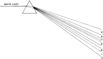
may or may not correctly identify the figures.

NAGEL ANOMALOSCOPE

The Nagel anomaloscope uses prisms to separate white light into the spectral colors. Narrow slits allow narrow-band colors to be seen by the subject, who is asked to match a 589-nm yellow with a mixture of a 545-nm green and a 640-nm red. Looking into the instrument, the subject sees a split field. He or she can control the intensity (luminance) of the yellow, which is in the bottom half. The red and the green completely overlap each other in the top half. Their luminance is fixed. The subject can vary the relative quantity of the red and green. Protanomalous persons use too much red to make the match, and deuteranomalous persons use too much green.

FARNSWORTH-MUNSELL TESTS

Farnsworth-Munsell tests use Munsell color chips mounted in caps. The colors differ only in hue. They have the same saturation and brightness. There are two tests: the D-15 and the FM-100. (The current model of the FM-100 actually has 85 chips.)

D-15 Test

The D-15 hues, which are selected from all parts of the color wheel, are provided in a box. The reference cap (blue) is fixed to the box. The examiner removes the other caps from the box and arranges them in random order. According to the manual, the examiner then states, “The object of the test is to arrange the buttons according to color. Take the button which looks most like the reference button and place it next to it, then . . .” After the test is finished, the examiner flips over the box and records the order of the chips. Trichromats arrange them from 1 to 15. Deutans arrange them as follows: 1, 15, 2, 3, 14, 13, 4, 12, 5, 11, 6, 7, 10, 9, and 8 (Fig. 31); protans arrange them as 15, 1, 14, 2, 13, 12, 3, 4, 11, 10, 5, 9, 6, 8, and 7. The examiner then connects the numbers on the score sheet in the order in which the patient has placed them (Fig. 32).

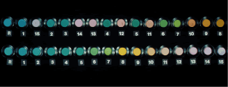
Fig. 31. D-15 test as seen by a deuteranope (top) and by a trichromat (bottom).

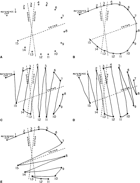
Fig. 32. A. Score sheet for the D-15 test. B. Normal trichromat. C. Deuteranope. D. Protanope. E. Tritanope.

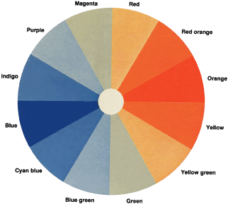
To understand why protans and deutans arrange the colors as they do and how the D-15 so neatly separates these defects, let us return to the 
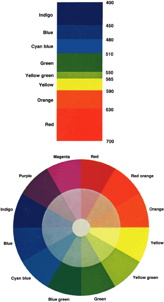
color wheel and assume that we are testing a deutan (see Fig. 29). The deutan's neutral axis passes through green and magenta. Both are seen as gray. The deutan cannot distinguish one from the other. Recall from our discussion about the color wheel that if we add a little yellow to green, we get yellow green; if we add a little yellow to magenta, we get red. A trichromat can easily distinguish red from yellow green. The deutan, however, sees green as gray. To the deutan, adding yellow to green is the same thing as adding yellow to gray. Similarly, the deutan sees a mixture of red purple and yellow as a mixture of gray and yellow. Clearly, then, the deutan also cannot distinguish yellow green from red. Both are seen as light yellow. Further, for a trichromat, yellow green plus more yellow results in nearly pure yellow, and red plus more yellow makes red orange. The deutan cannot distinguish these colors either. Both are seen as a darker yellow.

Let us look at the colors on the other side of the neutral axis. To a trichromat, magenta plus blue results in purple, and green plus blue results in blue green. To the deutan, however, both mixtures are seen as light blue. The deutan cannot distinguish purple from blue green. For the deutan, therefore, we can predict which hues will be confused by drawing lines through a color wheel parallel to the neutral axis (see Fig. 29). Similar lines of confusion can be drawn for the protan and tritan. The D-15 is a color confusion test that takes advantage of these lines. When we plot the deutan's order of chips on the score sheet, we see parallel lines between the colors we would have expected the deutan to confuse (see Fig. 32).

Because the protan and tritan have different neutral axes from the deutan, they confuse different hues. For example, the protan's axis of confusion runs parallel to the red and blue-green axis. The lines printed on the score sheet allow us to make a quick diagnosis. The test can, therefore, distinguish between protans, deutans, and tritans.

The hues of the D-15 test were chosen so that persons with mild color defects (anomalous trichromats) can pass. It does not distinguish between mild and moderate color deficiency. It is felt that those who pass the test can perform almost all functions in our society that depend on hue discrimination.

FM-100 Test

In the FM-100, 85 hues, which, if arranged in a circle, would make a color wheel, are divided into four boxes. The dominant wavelengths of box one run from red to yellow; box two, from yellow to blue green; box three, from blue green to purple; and box four, from purple back to red. Therefore, unlike the D-15, which allows the subject to see colors from 360 degrees of the color wheel at one time, the FM-100 allows the subject to see colors from only 90 degrees at one time. The subject arranges the caps of each box in order. After the subject has finished, the examiner flips over each box and notes the order of placement. Please consult the FM-100 manual for a complete explanation of the method of scoring. Basically, the score for a cap is the sum of the differences between the number of that cap and the numbers of the caps adjacent to it.


Recorded order567813119
Score for the cap 22674 
How derived 1±11±11±55±22±2 


The cap scores are then plotted on the score sheet (Fig. 33). Notice that 2 is the lowest possible score. However, when the total error score is computed, 2 is subtracted from each cap score. For example, the error score for caps 6, 7, 8, 13, and 11 (shown previously) are 0, 0, 4, 5, and 2. The total error score is the sum of these corrected error scores.

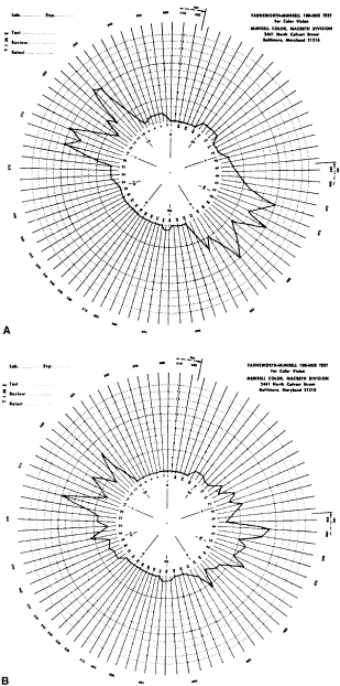
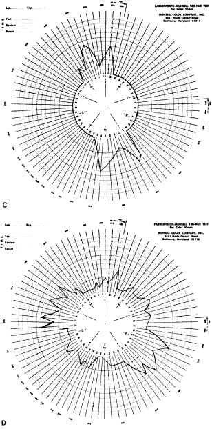
Fig. 33. Score sheet for the FM-100 test. A. Deuteranope. B. Protanope. C. Tritanope. D. Acquired red-green deficiency.

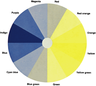
To understand why the deutan, for example, makes large errors in some parts of the color wheel and no errors in other parts, let us return to the color wheel as it is seen by the deutan (see Fig. 29). Near the deutan's neutral points, he or she makes few errors. The deutan can easily distinguish blue green from yellow green. They are seen as light blue and light yellow. On both sides of the neutral point the chips are arranged in the order, as he or she sees it, of increasing blueness or yellowness. Also, recall that in the D-15 test, the test taker can select caps from all areas of the color wheel, whereas in the FM-100 the subject can select caps from only one quarter of the color wheel at a time. Therefore, the subject cannot make the same confusions in the FM-100 that can be made in the D-15. Therefore, in the FM-100 the deutan makes the largest errors 90 degrees away from his or her neutral axis. For example, the deutan cannot distinguish red orange from yellow because both are seen as dark yellow and cannot distinguish cyan blue from blue purple because both are seen as dark blue.

The FM-100 was designed for two purposes. The first purpose is to separate persons with normal color vision into classes of superior, average, and low color discrimination. A total error score of 0 to 16 indicates superior color vision and is found in 16% of the population. A score of 20 to 100 indicates average color vision and is found in 68% of the population. A score greater than 100 indicates low color vision and is found in 16% of the population. The second purpose is to measure the zones of color confusion of persons with either congenital or acquired color vision disorders. It is probably the best test for this purpose. Characteristic score sheets for protans, deutans, and tritans are shown in Figure 33. For protans, the midpoint of the zone of maximal error is between chip 62 and 70; for deutans, between 56 and 61; and for tritans, between 46 and 52. When a patient makes large errors in all parts of the color wheel, he or she must have an acquired color vision disorder.

KOLLNER'S RULE

As a general rule, the errors made by persons with optic nerve disease tend to resemble those made by protans and deutans, whereas those made by persons with retinal disease resemble those made by tritans. Optic neuritis, compression of the optic nerve, Leber's hereditary optic atrophy, and most other optic nerve conditions affect the red-green axis more than the blue-yellow. Autosomal dominant optic atrophy and glaucoma are two exceptions. Fluid in or under the retina (central serous chorioretinopathy, shallow retinal detachment, macular edema) affects the blue-yellow (tritan) axis more than the red-green axis. On the other hand, degenerative conditions such as cone dystrophy and Stargardt's flavimaculatus often have a predominantly red-green defect. The FM-100 test, discussed previously, helps to distinguish acquired from congenital color vision disorders.

Back to Top
DEMONSTRATION REQUIREMENTS
  1. Three 35-mm slide projectors.
  2. A slide for projecting a blue circle of light. To make this slide, photograph a white circle placed on a piece of black felt. Use black-and-white film. Then, tear off the cardboard to get the film out. Insert it and an identically sized piece of a Kodak Wratten Filter #47, Catalog #1495787, into a plastic slide mount.
  3. Two slides for projecting red circles of light. Use Kodak Wratten #29, Catalog #1495621.
  4. A slide for projecting a green circle of light. Use Kodak Wratten #61, Catalog #1495894. An additional neutral density (ND) filter 0.2 may be necessary for color balance.
  5. A slide containing a clear circle overlapped with ND filters 0.4 and 1.0 (i.e., a total of 1.4). In other words, make the slide as in #2, but insert NF filters instead of colored ones.
  6. A 75 × 75-mm ND filter 1.0 mounted in a Kodak gelatin filter frame, Catalog #1486638.
  7. A darkroom.
  8. A screen or a white wall.
Back to Top
DEMONSTRATIONS
  1. Hue. Using separate projectors, project the red, green, and blue circles. Overlap them on the screen to obtain different colors. For example, overlapping red and blue yields magenta; overlapping red and green yields yellow. By dimming one of the colors, the resultant color changes. Place the ND filter 1.0 over the red light in the aforementioned mixes. The magenta becomes blue purple and the yellow becomes yellow green. When all three lights overlap, the color should approximate white.
  2. Saturation. With one projector, project the red circle. With another, project the circle with ND filters 1.0 and 0.4. Pink will appear where they overlap.
  3. Brown is a low-intensity yellow or orange. With one projector, project a small yellow square of light. With another, project unfiltered light with a small black square in the center. (These slides can be made by the same technique used for the color circles.) Overlap the slides, and cover #2 to observe the yellow. Now uncover #2 so that the yellow light is surrounded by unfiltered light. The yellow will appear khaki. If you now cover the lens projecting #1 with a 75 × 75-mm red filter, the yellow will be browner.
  4. Bezold-Brücke phenomenon. Project two red circles. Dim one by covering the lens with a 75 × 75-mm ND filter 1.0. It will appear redder (less orange) than the other.
  5. Abney effect. Overlap a green light with the circle with the ND filters 1.0 and 0.4. Where they overlap, the green appears to be more of a yellow green.
  6. Fatigue and afterimage. Project any color and stare at it without moving your eyes. It will appear to fade. If you now suddenly turn off the projector, you will see the afterimage.(1–26)
Back to Top
SUGGESTED READING

1. Adams A, Spivey B. Color vision. In: Records R (ed). Physiology of the Human Eye and Visual System. Hagerstown, MD, Harper & Row, 1979:453–481

2. Bowmaker J. Evolution of colour vision in vertebrates. Eye 1998;12:541

3. Boynton R. Color, hue, and wavelength. In: Carterette E, Friedman M (eds). Handbook of Perception. New York, Academic Press, 1975:301–350

4. Cornsweet T. Visual Perception. New York, Academic Press, 1970

5. Farnsworth D. The Farnsworth-Munsell 100-Hue Test. Baltimore, Munsell Color, 1949

6. Farnsworth D. The Farnsworth Dichotomous Test for Color Blindness. Panel D-15. New York, Psychological Testing, 1974

7. Gerritsen F. Theory and Practice of Color. New York, Van Nostrand, 1974

8. Hurvich L. Color Vision. Sunderland, MA, Sinauer, 1981

9. Jacobs G. Primate photopigments and primate color vision. Proc Natl Acad Sci U S A 1996;93:577

10. Jacobs G. Photopigments and seeing: Lessons from natural experiments. The Proctor Lecture. Invest Ophthal Vis Sci 1998;39:2205

11. Jameson D, Hurvich L. Visual Psychophysics. New York, Springer-Verlag, 1972

12. Krech D, Crutchfield R, Livson N. Elements of Psychology. New York, Alfred A. Knopf, 1969

13. Krill A. Abnormal color vision. In: Potts A (ed). The Assessment of Visual Function. St Louis, CV Mosby, 1972:136–160

14. Krill A. Hereditary retinal and choroidal diseases. In Krill A (ed). Evaluation of Color Vision. Hagerstown, MD, Harper & Row, 1972:309–340

15. Linksz A. An Essay on Color Vision. New York, Grune & Stratton, 1964

16. Linksz A. Reflections, old and new, concerning acquired defects of color vision. Surv Ophthalmol 1973;17:229

17. Marmor M, Ravin J. The Eye of the Artist. St Louis, CV Mosby, 1997

18. Martin P. Color processing in the primate retina: Recent progress. J Physiol 1998;513:631

19. Moses R. Color vision. In Moses R (ed). Adler's Physiology of the Eye. St Louis, CV Mosby, 1970:626–639

20. Nathans J. The evolution and physiology of human color vision: Insights from molecular genetic studies of visual pigments. Neuron 1999;24:299

21. Neitz M, Neitz J. Molecular genetics of color vision and color vision defects. Arch Ophthalmol 2000;118:691

22. Pichaud F, Briscoe A, Desplan C. Evolution of color vision. Curr Opin Neurobiol 1999;9:622

23. Pokorny J, Smith V, Verriest G et al. Congenital and Acquired Color Vision Defects. New York, Grune & Stratton, 1979

24. Rubin M, Walls G. Fundamentals of Visual Science. Springfield, IL, Charles C. Thomas, 1969

25. Smith V. Color vision of normal observers. In: Potts A (ed). The Assessment of Visual Function. St Louis, CV Mosby, 1972

26. Wissinger B, Sharpe L. New aspects of an old theme: The genetics of human color vision. Am J Hum Genet 1998;63:1257

Back to Top